

Colors can be intimidating, and even feel like magic. Get a color combination wrong, and a painting can feel entirely off balance. Get it right, and everything clicks.
The good news is that there is a method behind choosing color combinations. Once you learn how to pair colors, choosing a combination will be far less stressful.
Start With the Color Wheel
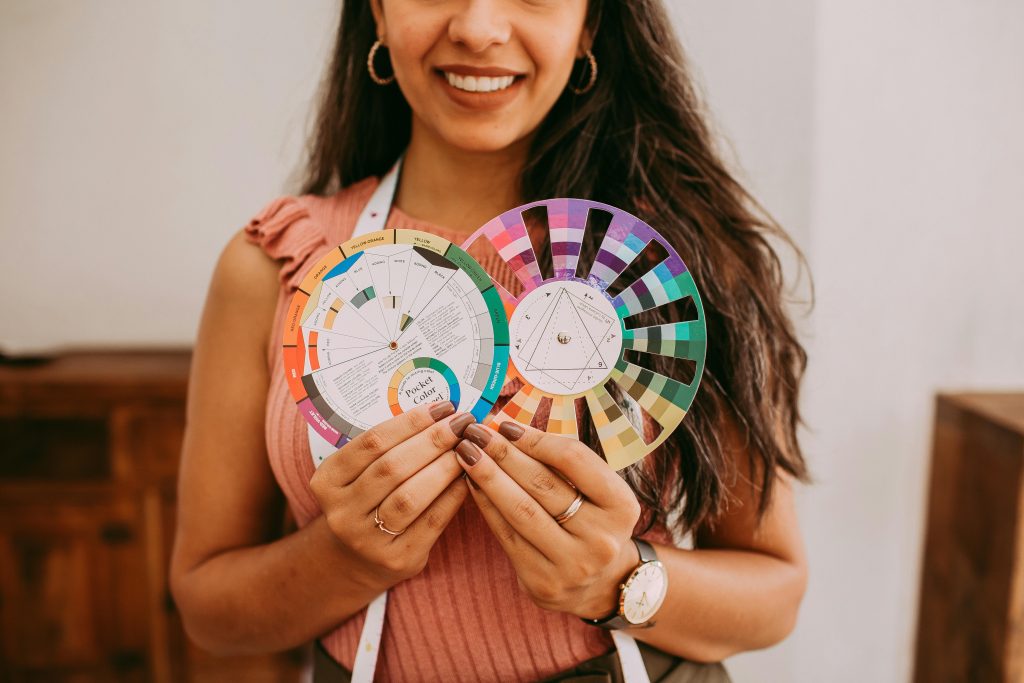
Every artist should have a color wheel on hand. A color wheel shows how colors pair together, and how some combinations clash. Some pairs work well, and some can make a painting feel off.
These color combinations are some of the most common you’ll find in the color wheel and will help you determine how to model color combinations in your work.
- Complementary: colors opposite of each other.
- Analogous: colors next to each other.
- Triadic: three evenly spaced colors around the wheel.
- Split complementary: one color and the two colors next to its opposite.
- Tetradic: four evenly spaced colors around the wheel.
- Monochromatic: varying tints and shades of one color.
Every color combination gives the artwork a different feel. Complementary colors feel very high contrast and create a lot of energy. At the same time, analogous colors are much calmer and easier to look at.
The Three Things That Make a Color
Before you build any palette, know these three basic color traits:
- Hue: the actual color name, like red or blue
- Value: how light or dark the color is
- Intensity: how pure or dull the color looks
These three things work together. Change one and the whole mood of your painting shifts. Most artists get stuck here. They pick colors they like, but forget to balance value and intensity.
The One Rule You Can’t Break
Here’s the big one. Every artist needs to know this.
If you change the value, shift the hue too.
That means when a color gets lighter or darker, it should also shift a little on the color wheel. Warm light needs cool shadows. Cool light needs warm shadows. They go in opposite directions.
Try it with green. Start with a mid-tone green. For the lighter version, shift the hue toward yellow. For the darker version, shift it toward blue. You’ll end up with a palette that feels alive and natural. This is what separates flat paintings from ones that glow.
Quick Tips for Better Palettes
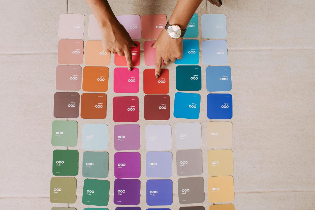
Some simple habits can save you time:
- Rather than using every color to its full strength, tone some down so that one color leads the eye.
- Before you even start, arranging your palette from light to dark will help you to see the full range of colors.
- Choose one main color for the mood and let the other color support it.
- Highlight and shadow colors should have lower intensity than the mid-tones.
Colors are like voices in a room. If everyone shouts, it is just a noise. Let one voice lead and the rest be quiet.
Complementary Colors Are Powerful
Red and green. Blue and orange. Yellow and violet. These pairs create the strongest contrast on the wheel. Place them next to each other, and they almost vibrate.
Artists have used this for centuries. Van Gogh painted sunflowers in orange against deep blue backgrounds. Matisse placed red dancers on green land. The contrast grabs your attention fast.
Be careful, though. Full-strength complementary colors can feel overwhelming. Tone one of them down to find balance. Let one color lead and use its opposite as an accent.
Build Your Palette With a Plan
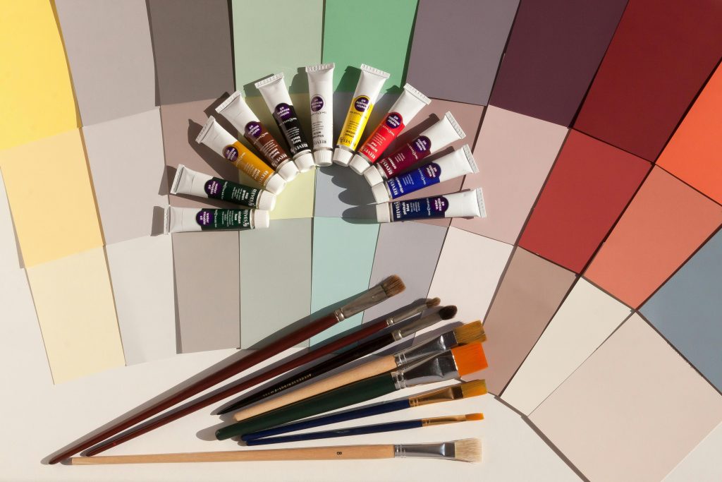
Meaningful palettes are not just collections of nice colors. Establish an emotion that you would like to evoke. Select an appropriate color. Add to that emotion using various value shifts and hue alterations.
Excellent palettes are the result of a process. Many deliberate decisions accumulate. Grow your knowledge, and when appropriate, you can disregard it.